

Every once in a while, we open up a member’s site inside Oh My Hi and just… stop. Not because it’s flashy. Because it’s exactly right for the person who built it.
So this week we’re doing something a little different. Here are five real Oh My Hi sites — five completely different businesses — and the one smart thing each one gets right. Different niches, different goals, different personalities. But as you’ll see, they all quietly do the same two things. Steal whatever sparks an idea. 😉
What makes a small business website actually work?
A small business website works when it gives every visitor one clear next step and sounds like the person who built it. That’s it. Not more pages, not more animation, not a bigger menu. The five sites below prove it from five completely different angles.
Ellen: proof that “simple” converts
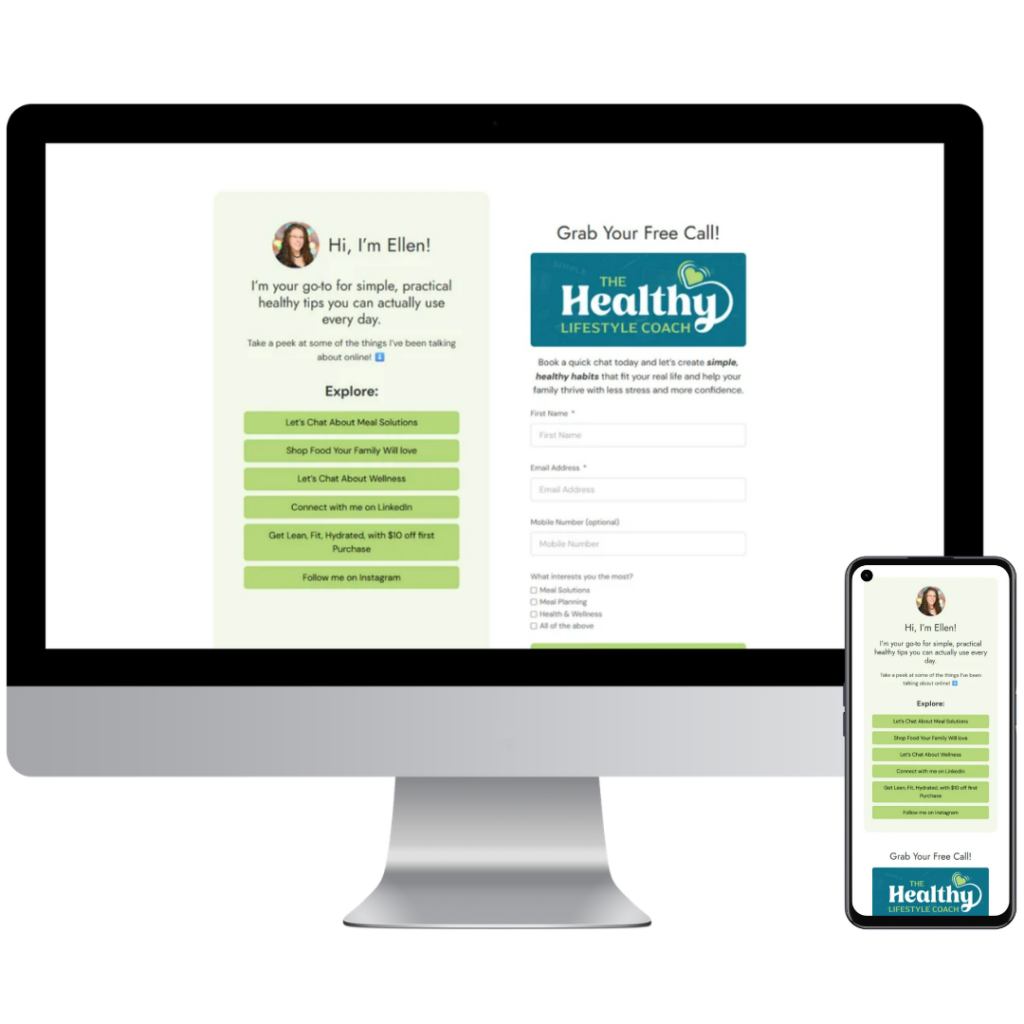
Ellen is a wellness coach, and her homepage does exactly what a homepage should. One clear hero. One clear ask (“grab a free call”). Zero clutter. Nothing about it screams “template” — it just feels like her.
Here’s why that works: people don’t need ten options when they land on your site. They need one obvious thing to do next. Whether you’re a health coach like Ellen or a bookkeeper taking on new clients, one strong invitation will always beat five competing ones.
Heather: a site that matches its mission
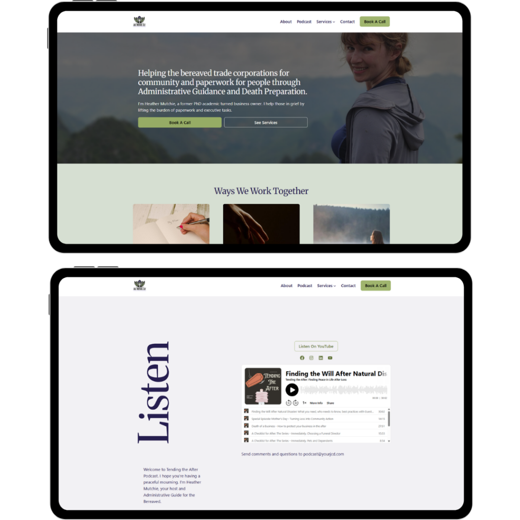
Heather supports people navigating loss, and her site sounds like that — quiet, calm, unhurried. Her podcast page keeps it refreshingly simple: one embed, a short welcome, a way to reach her. No noise competing with the tone she’s built everywhere else.
Your site doesn’t have to be loud to be effective. It has to sound like you. A children’s music teacher and a grief-support podcaster should not have the same website energy — and on Oh My Hi, they don’t have to.
Lauren: one page doing the work of five
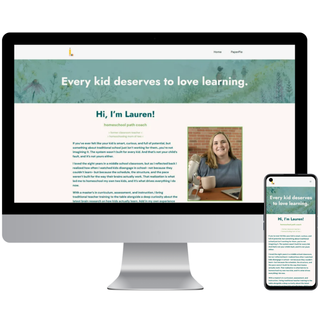
Lauren is a homeschool coach, and instead of scattering her business across a dozen pages, she put the whole thing on one: her story, three clear ways to work with her, and a newsletter signup. On mobile — where most of her visitors actually are — it never feels cramped. It just scrolls.
Do you really need a big website to look professional?
No. You need a page that answers “how do I work with you?” without making people hunt for it. Lauren’s one-pager looks every bit as established as a ten-page site, because every extra click is just another chance for someone to lose interest. A candle maker or a virtual assistant could launch tomorrow with a single strong page and look completely legit.
Melany: turning “just looking” into a lead
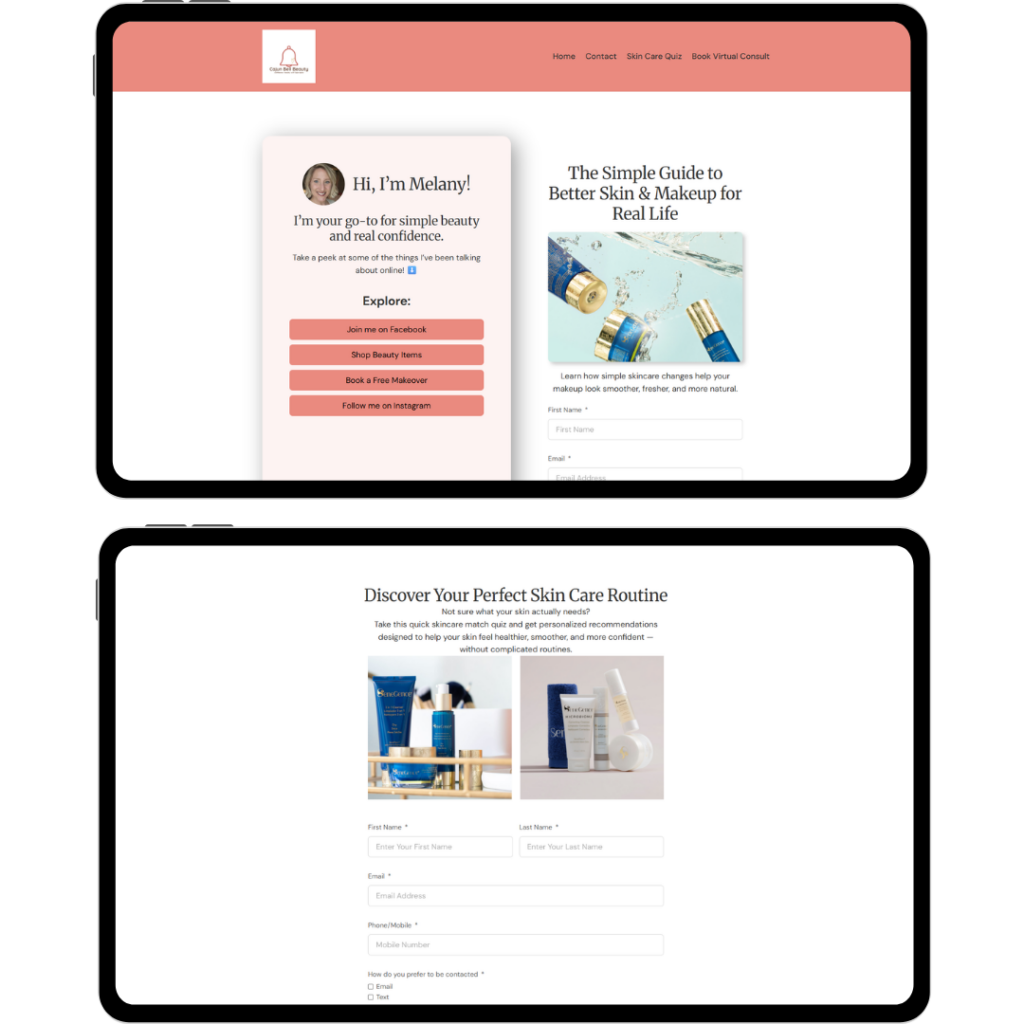
Melany is in skincare and beauty, and instead of hoping visitors browse and buy, she built a short skin-type quiz that collects contact info and points people toward the products that actually fit them. Casual visitor in, warm lead out.
How do you turn a website visitor into a lead?
Give them something low-pressure and genuinely useful in exchange for their contact info — a quiz, a checklist, or a free call. A quiz feels like a gift, not a form. People will happily answer a few fun questions about themselves long before they’ll fill out a box marked “contact us.” A fitness coach could do the same thing with a “what’s your starting point?” quiz, or a stylist with a “find your palette” one.
Tony: even the ‘boring pages’ look intentional
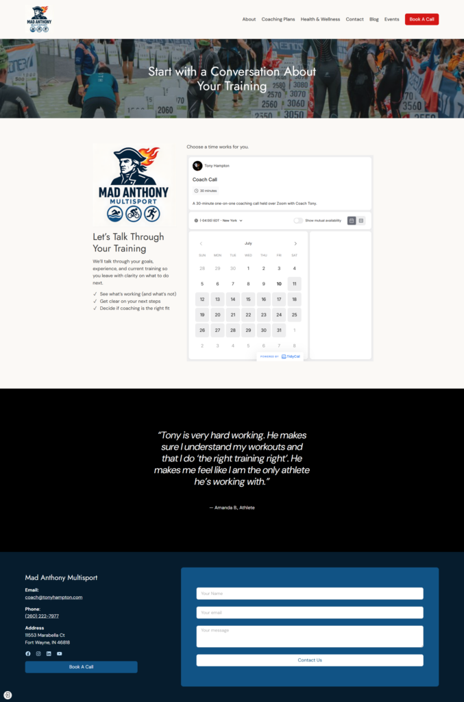
Tony is a triathlon coach, and his site is the biggest of the bunch — About, coaching plans, health and wellness, a blog, events, all of it. But the page that stands out is the one most people neglect: his booking page. His scheduling embed is clean and on-brand, which gives visitors the confidence to actually click and book.
Booking and scheduling pages are usually where sites get lazy — generic, default-looking, an afterthought. Tony’s is proof that your “utility” pages deserve the same care as your homepage. That’s often exactly where the sale happens.
The two things every one of these sites gets right
Different niches. Different goals. Different personalities entirely. But every single one of these sites does the same two things:
- It gives a visitor one clear thing to do next.
- It looks like it took a developer — when really, it just took a Sunday afternoon.
Your 2-minute homepage check
Go look at your own homepage right now. Is there one clear next step, or five? Does it sound like you, or like a template? Are your important pages (booking, contact, services) getting the same care as your homepage? Could a first-time visitor figure out how to work with you in under ten seconds?
Fix even one of those and your site gets stronger this week.
Every site above was built inside Oh My Hi. No developer, no waiting on a support ticket to move a button. And if you want a second set of eyes on your own site, bring it to a live support call — real humans, every week — and Lisa can walk you through it. You can also just reply to any of our emails and we’ll point you in the right direction.
Leave a Reply