July was full of good website advice — from a live Insider session to some genuinely great “aha” moments straight out of our weekly support calls. Here’s the recap.
Oh My Hi Insider: Page vs. Post vs. Landing Page
This month, Sami and Lisa tackled a question we hear all the time: how do I keep my website current without losing my mind?
Here’s the short version:
- Landing pages + redirects are your best friend for launches and promos. Oh My Hi’s built-in redirect tool means you can take a page down after an event without ever leaving a dead link — and reuse the same page (and the same simple slug!) next time around.
- Your homepage deserves a monthly “date.” A quick check that your announcement bar, header, and priorities still reflect what’s actually going on in your business right now.
- Time-sensitive info belongs in blog posts, not baked permanently into your core pages. Write it once, keep it evergreen where you can, and just note when it’s been updated.
A Few Favorite Tips from Live Support
Some of the best advice this month came straight out of our weekly support calls:
Prettiness doesn’t sell — substance does. More than one hero section got a reality check this month: if your top-of-page real estate is just a big pretty image with no context, you’re wasting your best real estate. Tell people why they should stay.
Google can’t read words on an image. If you’re designing graphics in Canva with text baked in, that text is invisible to search engines. Keep your key messaging as real text on the page, not inside a picture.
You can embed a YouTube (or Vimeo) video right on your site so visitors never have to click away to watch — perfect for pop-up shops or video intros.
QR codes are easier than you think. Grab any URL from your site, drop it into a QR generator (Canva has a built-in one), and you’re done.
These tips came straight from real users bringing real questions to our weekly live support call — no question too small, and Lisa walks you through it step-by-step until it clicks. Support like this is hard to find anywhere else.
From the Community: “Don’t Be a Needle in a Haystack”
One of our favorite stories this month came from Amber, who shared how she ran her own massage practice back before social media was what it is today — and how, over a decade later, people still find her old website when they Google around.
Her point: it wasn’t one big lucky break. It was showing up in a lot of small places — a blog post, a couple of Pinterest pins, an email, a story slide — so that people had more than one way to stumble onto her.
The takeaway for your own site: one piece of content can open a dozen doors, if you give it more than one place to live.
A Few Sites That Caught Our Eye This Month
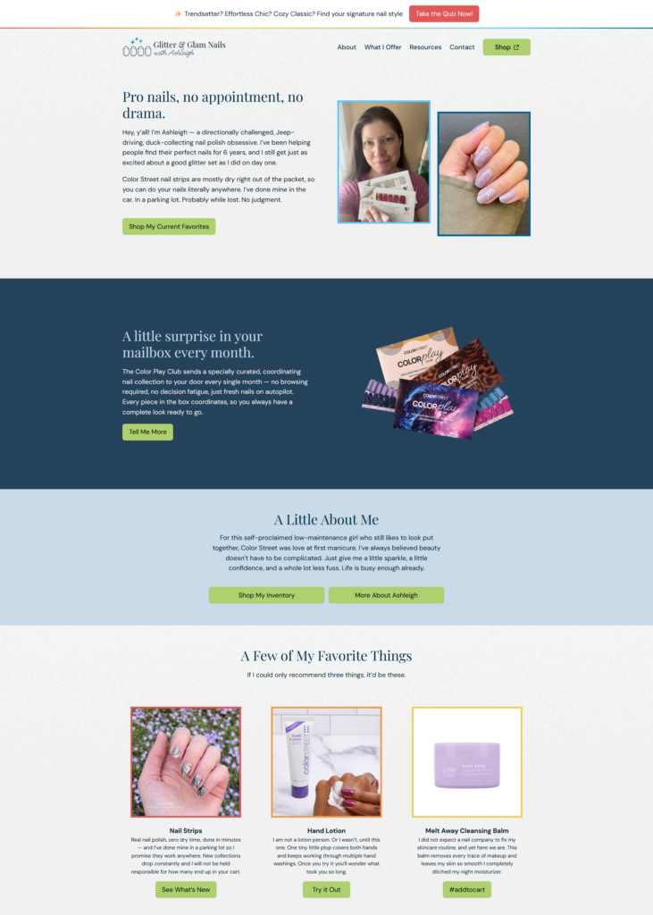
Ashleigh’s colorful refresh.
Ashleigh wanted her site to feel a little more “her” — so instead of a full rebuild, we brought in some playful color accents inspired by her own business card design, cutting back on the green that had been dominating the page. Small tweaks, big personality shift.
Why this works: you don’t need to redo your whole site to make it feel more like you. Sometimes it’s just about finding the one or two spots where a little more color, personality, or contrast makes everything click.
New sites, fast.
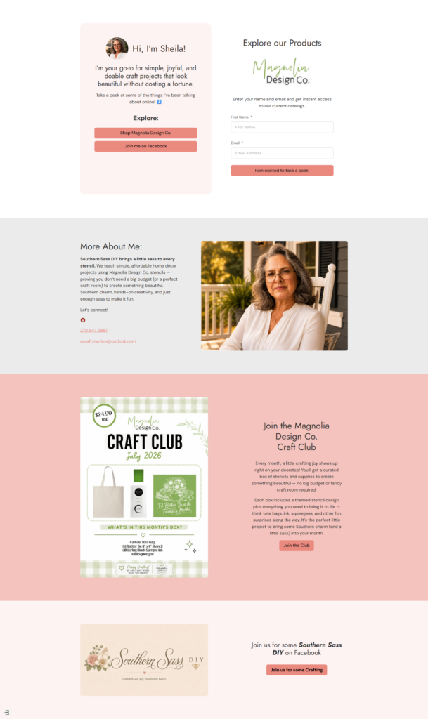
A couple of shoutouts this month to users who got their businesses live quickly with our simple one-page Capture & Convert template:
Sheila, who’s now got her craft business online and ready to share — congrats on getting your site live!
Nora, who launched her jewelry business site and is officially open for visitors — congrats, Nora!
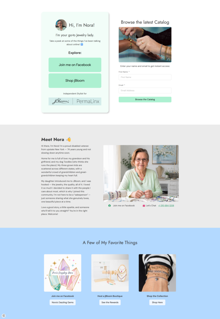
If you’ve been putting off getting a site up because it feels like a big project, these two are proof it doesn’t have to be. One page, one clear starting point.
Whether you’re building, tweaking, or just getting started — we’re cheering you on. 🧡
Leave a Reply